Tuesday, May 27, 2025

Module 2 - Python Fundamentals

During the second week of the GIS programming module, specifically in Exercise 2, we focused on the foundational elements of the Python programming language. This included working with various data types such as numbers, strings, variables, and lists. We explored the use of functions, methods, and modules, and learned how to save our code as scripts. Additionally, we practiced writing conditional statements and employing loop structures.

Furthermore, we gained practical experience in executing a geoprocessing tool from the notebook that interacts with a layer in ArcGIS Pro. We also learned the process of incorporating existing code into the ArcGIS Pro Notebook by copying and pasting the code into a notebook cell.

This week’s lab assignment comprises four distinct steps.

In the first step, the task involves assigning my full name as a string to a variable. Subsequently, the full name should be split into individual components, resulting in a list of names. Finally, indexing techniques will be employed to extract and print my last name.

The second step involves working with a prewritten code that generates a list of players participating in the dice game. Upon importing the random module and executing the code, I encountered an initial error TypeError: can only concatenate str (not "int") to str. To fix this error I added str to word (dice). After rectifying this issue and running the code again, I identified a second error, which required changing a capital 'X' to a lowercase 'x'. After addressing these errors, the code executed successfully.

In the third step, a loop must be created to generate and add 20 random numbers, each ranging from zero to ten, into a list. Finally, the fourth step requires the implementation of a loop designed to remove a specified integer from the previously generated list and print the updated list. 


Results from running the code:


In conclusion, completing the Lab for module 2 proved to be quite challenging, utilizing IDLE to compile the code in a separate script window was more efficient compared to ArcGIS Notebook and its cell functionality

Monday, May 19, 2025

Module 1 - Python Environments & Flowcharts

During the first week of GIS programming, we focused on executing Python scripts and engaging with the Python interpreter IDLE as well as Python (Jupyter) ArcGIS Notebook. Additionally, we examined flowcharts and developed our ability to think algorithmically through their use. 

Python is recognized as a simple yet powerful programming language. It is notably easier to learn compared to other programming languages, such as C++. Furthermore, it is free and open-source software. A key distinction of Python in relation to other programming languages is that it is an interpreted language. Unlike compiled languages, which necessitate a compiler to convert source code into machine code for execution, Python processes code sequentially, executing it line by line without the need for a compiler. This method of direct execution promotes a more straightforward approach to both code development and debugging. 

We were also introduced to various script editors and IDEs (Integrated Development Environments) that are utilized for writing and executing scripts. The three primary IDEs we explored for coding and testing purposes are IDLE (Integrated Development and Learning Environment), PyCharm, and Spyder. 

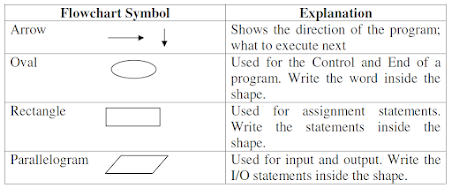
The second part of the module concentrated on flowcharts and their significance in programming, as they assist in visually and logically organizing a program. Flowcharts employ predefined symbols, such as ovals, rectangles, and parallelograms, to create a visual representation of the program. Arrows are utilized to indicate the direction of the program flow and the sequence of execution.

Agarwal_et_al_2010_Chapter 3 Page10

Utilizing our understanding of algorithmic thinking through flowcharts, we developed a flowchart to represent a Python script that converts 3 radians into degrees using the formula: Degrees = Radians * 180/Pi where Pi = 22/7 


Finally, this week, we were assigned to read "The Zen of Python" poem and to compose a paragraph reflecting our interpretation of its meaning.

“Zen of Python”, by Tim Peters, delves into the constitution of a well-established lines of code. In the poem, Tim remarks that a code must be well-structured or “beautiful”, as well as it directly and explicitly states what it does. A well-made code is simple; but if it were to be complex, it should not be made difficult. Tim remarks that a flat code, rather than nested, is better as it would be easily understood and more easily maintained. Furthermore, making a code neat and unscattered produces easy readability to its viewer.

According to the poet, even though there may be special cases, these special cases should never warrant a need to break the abovementioned rules. The poet goes on to say as well that although a practical code, as in one that works, may have a few errors, for instance, is better than a pure, mistake-free code, errors must never be left unlooked and remain unresolved. Furthermore, these errors must be found and fixed as soon as possible. Thus, a coder must always look for and research the best approach to building lines of code and refuse the urge to guess their work. The poet refers to Dutch programmer Guido van Rossum, the author of Python, stating that there is always one obvious approach to doing something.

Tim Peters closes off his poem remarking that fixing a code is better done progressively, rather than immediately, as the rush to do something may be worse than not doing it at all. And only when the implementation of a code is easy to explain is when such code is considered a good idea. Peters concludes with a reference to namespaces, or the system that ensures all names in a program are unique and can be used without ambiguity, referring to the uniqueness of all coders, and urging them to go out and create their codes.


Thursday, May 1, 2025

Module 7 - Neocartography, 3D Mapping and Google Earth

Lecture material for the final module in cartography covered several aspects from Neocartography and VGI (Volunteered geographic information) to 3D and Google Earth mapping. We explored the growth of volunteerism in gathering geographic information, mainly due to citizens mapping their communities. This has led to Volunteered Geographic Information. Technologies like Wikimapia and OpenStreetMap enable users to contribute to maps, but this can also create accuracy challenges. Many platforms require users to build credibility, and AI can help find false information.

In the 3D videos, we explored the integration of 2D and 3D visualizations within ArcGIS Pro, as well as the application of Lidar (Light Detection and Ranging) technology for enhanced 3D visualization. Lidar is a remote sensing technique that gathers data via aircraft equipped with laser technology, which emits laser light to measure distances and collect various data points for analytical purposes. Furthermore, we identified the method for producing animated videos in Google Earth Pro, which allows us to efficiently communicate our findings to audiences who may lack access to GIS applications.


During this week's lab session, we developed a population dot density map and a tour map utilizing ArcGIS Pro and Google Earth Pro. A significant advantage of employing Google Earth Pro for mapping purposes is its availability as a free download, making it accessible to individuals without a background in Geographic Information Systems (GIS). Furthermore, geographic data can be saved and shared in the form of KML (Keyhole Markup Language) files or KMZ files, which are compressed versions of KML. These formats are specifically designed for displaying geographic information in applications like Google Earth.

Initially, we incorporated the surface water layer into ArcGIS Pro and applied the appropriate symbology, ensuring it matched the legend provided in the accompanying JPEG file. Utilizing "Layer to KML" tool in ArcGIS pro to convert the layer into a KML file format. Double clicking on the new file will open it in Google Earth Pro. Following this, we added the legend along with two additional layers: one for counties border and another for the dot density layer. To ensure the dot density layer displayed prominently, we adjusted its settings in the altitude tab under layer properties. Consequently, we created a new folder within My Places and transferred the layers from the temporary places folder into this newly established folder, and saved the layers as a KMZ file.

The subsequent task involves creating a Google Earth tour that highlights the entirety of South Florida, including Miami metropolitan area, Downtown Miami, Downtown Fort Lauderdale, Tampa Bay area, St. Petersburg, Downtown Tampa, and culminating back at the full map of South Florida. To achieve this, we generated a placemark for each designated location by utilizing the Add Placemark button on the toolbar. Finally, we recorded the tour using the "Record a Tour" button, saved it, and organized it alongside the other map layers, ultimately saving the locations as a KMZ file for the tour.

Creating a seamless tour in Google Earth presented significant challenges due to its limitations. After numerous attempts, I successfully recorded a tour that meets my expectations. One key lesson learned in crafting a smooth tour in Google Earth is the importance of establishing multiple placemarks for the city. This approach facilitates a fluid transition between placemarks, resulting in a more cohesive and continuous movement throughout the tour.

Saturday, April 26, 2025

Module 6 - Isarithmic Mapping

This week's lab session will focus on isarithmic mapping. An isarithmic map is a specialized thematic map that employs color to depict smooth and continuous phenomena, such as elevation, temperature, or precipitation. Among the various types of maps, contour lines are particularly prevalent; they connect points of equal value to illustrate continuous elevation data.

The objective for this week is to create two isarithmic maps utilizing precipitation data for the State of Washington; a continuous tone map and a hypsometric tints map. The data utilized for this exercise has been prepared using the PRISM (Parameter-elevation Relationships on Independent Slopes Model) methodology.

The raster data representing annual precipitation (measured in inches) utilized in this map was sourced from the USDA Geospatial Gateway website. Data gathered from climate monitoring stations is transformed into grid points through various methodologies. Although these methodologies exhibit precision in flat terrain, they encounter increased complexity in mountainous areas. The Parameter-elevation Regressions on Independent Slopes Model (PRISM) has proven effective in modeling precipitation in sloped terrains. This technique combines point data with an elevation grid, such as Digital Elevation Models (DEM), to generate estimates of monthly, annual precipitation, and temperature. 

The initial map developed utilized continuous tone symbology. This representation method employs a gradient of colors that transition smoothly, rather than relying on distinct symbols or categories. In this approach, the colors on the map progress gradually from red to yellow, then to green, and ultimately to blue, creating a cohesive visual surface. The implementation of continuous tone symbology in these maps significantly improves the perception of continuity and fluidity in the presented data. Additionally, a hillshade effect was incorporated to further enhance the visual impact.

In the second map, we created a layout utilizing hypsometric tints, a hillshade effect, and contour lines. An isarithmic map featuring hypsometric tints employs contour lines and distinct colors to represent varying elevation levels. We employed ArcGIS Pro to convert the raster cell values into integers, facilitating the creation of hypsometric tints. Additionally, we utilized ArcGIS Pro to generate two new layers, a hillshade layer and a contour layer because elevation data is incorporated into the dataset. The hillshade layer was generated by utilizing the "Create Surface" function located within the Raster Analysis tab, while the contour layer was produced using the "Contour List" tool.

I found this week's laboratory session to be highly enjoyable. Upon completing the project, I took the initiative to download the PRISM data set for the year 2024 from https://prism.oregonstate.edu. I subsequently analyzed the yearly precipitation data for the continental United States, which further enriched my understanding of the creation and analysis of isarithmic maps.


Saturday, April 19, 2025

Moduel 5 - Choropleth and Proportional Symbol Mapping

The primary objectives for this week's module include understanding choropleth map classifications, selecting appropriate color schemes, employing SQL Query language, utilizing proportional or graduated symbols, and creating thematic picture symbols. Choropleth maps are a type of thematic map that employs various colors or shading to represent data visually. It is crucial to normalize data in choropleth maps to ensure accuracy in the results.

In this lab exercise, we will utilize the provided data to develop a choropleth map that illustrates the varying population densities across European countries, as well as the wine consumption levels in each country.

Mapping population density rather than raw population counts on a choropleth map is key to understanding how people are distributed. Raw counts can mislead comparisons between different-sized areas, as larger regions may appear more populated even if they are not dense. Normalizing population data provides a clearer picture and meaningful comparisons.

Analyzing European population data shows that Russia has the most people at 104,687,534, but its density is only 26.47 individuals per square kilometer, given its large area. In contrast, the Netherlands has a population of 16,852,340, with a much higher density of 487 individuals per square kilometer, demonstrating that it has a higher population density despite its smaller size.

The initial step involves incorporating the EuropePopulation dataset into a new ArcGIS Pro project. Upon reviewing the data table, we identified four countries; Monaco, Gibraltar, Malta, and Jersey, characterized by high population density but notably low wine consumption, which can be excluded from our analysis. Additionally, these countries occupy a relatively small geographical area. Given the potential for these countries may skew the results, we have opted to exclude them from our analysis. To facilitate this exclusion, we employed the SQL expression feature available within the advanced symbology options.

The population density field POP_DENSIT, which represents population normalized by area, was utilized to classify the data into four distinct categories: equal interval, quantile, standard deviation, and natural break. Upon analyzing four data classifications, I found that quantile classification best represents population density in European countries. It provides an even data distribution and a clear legend. In comparison, equal interval and standard deviation classifications showed uneven distributions, with some classes having few countries and others many.

Initially, I thought natural breaks would be the best approach because it groups data effectively, minimizing within-class variance. However, it resulted in some classes with very low counts. Thus, quantile classification proved to be the most appropriate choice, ensuring fair country distribution and clarity in the legend. Furthermore, I used a continuous gradient from light to dark, where lighter shades represent low population density and darker shades show high density. This method allows for quick comparisons of population densities, making it easy to identify countries with high or low population density.

Subsequently, I utilized the labeling properties to configure the labels for all countries, deliberately excluding those with very small land areas. In order to maintain control over the labels, I exported them as annotations, which enables the adjustment and repositioning of the labels as necessary.

Next, I duplicated the EuropePopulation layer and renamed it to WineProportional. This involved reclassifying the layer using the Wine_Cnsmp field and applying proportional symbols as the symbology. Additionally, I incorporated another layer and applied graduated symbols for its visualization. I used the graduated symbol method to show wine consumption data for each country. This method divides data into classes, each with a specific symbol size. I created five unique symbols for the five classification classes. This approach helped control symbol sizes and reduced overlap issues. However, size variations might be hard for some people to understand. To improve clarity, I designed custom symbols with different sizes and images to better represent the levels of wine consumption.

I would like to share that I utilized the Feature to Point tools to convert symbols into point data, which proved to be extremely beneficial. This functionality enabled me to move or delete symbology, allowing for greater flexibility in repositioning symbols on the map. Moreover, I utilized the site Color blind test simulator/ to check the PDF map for color blindness accessibility.


Type of Blindness 

Type of Blindness 


Type of Blindness 


Sunday, April 13, 2025

Module 4 - Data Classification

This week's module focuses on data classification, which is the process of grouping similar values into distinct classes. This technique is commonly utilized in choropleth maps, which employ varying color shades to represent data such as population statistics, election outcomes, and the spread of diseases. The choice of map classification is crucial for effective map presentation, as different classification methods applied to the same data can yield varying interpretations. In this lab assignment, we applied four distinct classification methods to the same dataset and compared the outcomes. The four classifications utilized are Equal Interval, Quantile, Standard Deviation, and Natural Breaks.

The objectives of this assignment include understanding the distinctions among the four classifications and comparing the results derived from the same data set. Additionally, it aims to identify the suitable data fields and classification method necessary for specific purposes, such as analyzing the distribution of citizens aged 65 and older in comparison to evaluating the overall senior citizen population.

The source data used in this analysis is derived from the Miami-Dade census. We developed two maps; the first map is based on the percentage of the population age 65 and older, while the second map represents the population age 65 and older, normalized by square footage. This normalization involves dividing the population count by the area in square feet. We chose to normalize the data by area to avoid potential misinterpretations that may arise from using raw data. For instance, when examining the raw data for census tract 107.04 and census tract 166, both tracts report the same population count for individuals age 65 and above. However, this figure can be misleading, as census tract 107.04 encompasses a significantly larger area of 17.7967 acres compared to the much smaller area of 0.384007 acres for census tract 166. To provide a more accurate representation of the data, it is essential to consider the area in square miles.

NAME10

NAMELSAD10

AGE_65_UP

sq_mi

107.04

Census Tract 107.04

505

17.7967

166

Census Tract 166

505

0.384007

This blog presents the first map, focusing on the classification of the population aged 65 and older in Dade County by percentage. I initiated a new ArcGIS Pro project and applied symbology to the PCT_65ABV field. The first classification method employed is equal interval, which divides the data range between the maximum and minimum values into equal classes based on the user-defined number of classes. In this case, the values range from 0 to 79.17. The difference, 79.17, divided into five classes results in intervals of 15.83. Consequently, class 1 encompasses values from 0 to 15.83, and class 2 ranges from 15.84 to 31.67, continuing in this manner. While this method is straightforward, it may not effectively represent the data, particularly if the data is not continuous, leading to some classes having zero counts while others have significantly high counts. In this analysis, classes 1 and 2 had counts of 343 and 169, respectively, while classes 3, 4, and 5 had counts of 8, 0, and 1, which can be misleading.

The second classification method is the quantile method, which divides data in ascending order into equal parts based on the number of assigned classes. For instance, with a total of 521 records we have in our data layer divided by 5 classes, each class will contain 104 records (521/5), with one record added to the first class. While this method ensures that no class has a count of zero, unlike equal interval classification, it may create misleading representations. Similar features can be assigned to different classes, while distinctly different features can be grouped within the same class. For example, class 5 ranges from 19.95 to 79.17, significantly broader than class 1 (0-8.96) and class 2 (8.97-11.74). This discrepancy arises when applying quantile distribution to non-linearly distributed data, potentially leading to arbitrary class breaks that lack meaningful interpretation.

The third method is the standard deviation classification method. This method organizes data into classes based on deviation values calculated from the mean. To determine these values, we first calculate the mean (μ) of the data, followed by the deviation from the mean using the formula  where N represents the number of observations. A low standard deviation indicates that the data is closely clustered around the mean, while a high standard deviation signifies a wider spread. In this analysis, the mean is 14.28, with a standard deviation of 7.18, a maximum of 79.17, and a minimum of 0. The data distribution shows that 28.98% falls into class 2, 39.54% into class 3, and 21.11% into class 4, indicating approximately 90% of the data clusters around the mean. Additionally, the histogram is right-skewed, featuring a longer tail on the right, which suggests that most data points are concentrated at the lower end, with fewer larger values extending to the right, likely due to outliers exceeding 2.5 standard deviations. A divergent color ramp was employed to effectively illustrate negative and positive standard deviation.

The last classification method is the natural break classification, or Jenks. It is a widely used method in cartography that organizes similar values through an algorithm identifying natural breaks in the data. This technique establishes class breaks to minimize variance within each class while maximizing variance between classes. Its application may result in differing numbers of observations within each group and can complicate comparisons between maps using different datasets due to its data-driven nature. It is particularly effective for datasets with uneven distributions without a significant skew towards either end. In this assignment, we categorized the data into five classes based on natural breaks. From analyzing the result, we observe that most data points fell into classes 2, 3, and 4, leading to uneven class ranges. Class 5 has a range of 29.86 to 79.17 due to the right-skewed distribution of the data.

In conclusion, it is essential to conduct a thorough analysis of the data initially to ensure that the presentation of the information is as accurate as possible. I previously worked with data classifications but I did not fully understand the differences between these classifications. After completing this assignment, I now have a clearer understanding of the distinctions between these classifications and how each one is being calculated.


Saturday, April 5, 2025

Module 3 - Cartographic Design in ArcGIS Pro

A good map should meet the user’s needs, be easy to use, accurate, clear, communicative, and visually appealing. There is no best way to create a map that is why it is important to follow rules and guidelines to support design choices. Module 3 introduces us to Gestalt’s principles of perceptual organization, developed in 1920. The theory explain how humans perceive individual components of a graphical image and subsequently organize these components into a cohesive whole.

The main key concepts for Gestalt’s map principle are visual hierarchy, contrast, figure-ground, and visual balance. Visual hierarchy organizes map elements based on their importance, highlighting essential features and minimizing less critical information. Contrast creates visual distinction between features using variations in spacing, size, shape, and color. The figure-ground relationship emphasizes the importance of assigning greater visual prominence to map features that are pertinent to the subject, thereby creating an illusion of proximity for the map user. Visual balance involves creating a balanced layout by adjusting the size, weight, and orientation of the map.

In this lab I will be creating a map showing public schools in Ward 7, Washington D.C. area and applying Gestalt’s principle in our map design. The design process starts with deciding how to share the map, this will influence the color schemes, scale, and file format. Next, choosing the scale and projection, then classifying and symbolizing the data. Finally, evaluating the map for clarity and making revisions if needed.

All necessary data for this lab has been provided. Upon adding the layers to a new project in ArcGIS Pro, I discovered that the school layer included all schools in the Washington D.C. area. At first, I utilized the "Select by Location" tool to isolate only the schools in the Ward 7 area and subsequently created a new layer from the selected schools. The primary objective of the map is to illustrate the locations of public schools in the Ward 7 area of Washington, D.C. My aim was to present the schools' locations with utmost clarity and to create a visual hierarchy. To achieve this, I employed a distinct Magenta color to symbolize the schools, setting them apart from other entities on the map. While maintaining a consistent symbol for all schools, I incorporated various color hues to represent different types of schools—elementary, middle, and high schools—and adjusted their sizes to enhance visual differentiation. Furthermore, I labeled the schools using larger text compared to other labels and added a halo effect for added emphasis.

For the road layer I applied a red color with varying thickness to the highways, contrasting with the dark gray used for the major roads, which establishes a clear hierarchy. Additionally, I utilized a dark gray color with a thinner line for the minor roads in comparison to the major roads. Although the map includes all roads, I have labeled only the major roads and highways to maintain clarity and improve readability.

For Ward 7 area layer, I propose utilizing a lighter color to differentiate it from the neighboring regions, thereby highlighting the study area and enhancing the overall figure-ground relationship. After testing several colors, I ultimately chose Mango color, as it effectively accentuates the study area. Moreover, this color improves the visibility of other colors within the vicinity. Additionally, I employed a dark brown dashed line to delineate the boundaries of the neighborhood clusters, as this color complements the Mango hue without overwhelming it. I also used the same color for labeling neighborhoods. Furthermore, applying a light gray color to the surrounding area effectively accentuated the focus on the study area.

The process of creating the layout and achieving a balanced design encountered challenges due to the geographical representation of the Washington, D.C. area and the specific location of Ward 7. A significant amount of white space surrounding the map needed to be effectively utilized for various map elements and information. I strategically arranged the elements based on their size and the data they represented. The legend was positioned in the top right corner of the map, utilizing the available space, while the inset map was placed in the upper left area. The north arrow and scale bar were located in the lower right section. To ensure layout balance, I utilized the remaining white space to incorporate a table listing school names and addresses. Furthermore, I selected a larger font for the title, positioning it at the top, which was the most appropriate location. The source data, preparer's name, and date were included at the bottom of the layout, using a smaller font size than the other text elements in the map layout.

In conclusion, the utilization of color to establish hierarchy and contrast within maps plays a crucial role in this exercise. The selection of colors should be strategically employed to improve the legibility of the map. Features that require emphasis should be assigned colors that distinctly stand out and contrast with those of less significant elements. Additionally, the color wheel should be utilized as a resource for making good color choices.